Digi-Scrapping for Free: Creating Titles in Gimp
Hello all, we're back for another tutorial in the "How to Digi-Scrap for Free" series.


In the previous installment, we created our very first scrapbook page. It wasn't bad, but the title was - well - boring. Just black text with a little drop shadow. Not very impressive.
In this tutorial we will cover three options for making a more interesting title.
For all three methods I tend to open a brand new image file of the approximate dimensions I need for my title and work there rather than add a dozen new layers to my page layout. It's just easier to see and deal with. I then copy all layers of the finished title and paste as a single layer into the scrapbook page.
* A shortcut for finding the approximate size of your title is to use the rectangle select tool on your scrapbook page to draw a box around the location you'll be placing the title. The dimensions of your box will appear in the lower left of your page window. Add a little to these numbers and open a new document of that size. We will refer to this document as your "Title Workspace"
The first method I will cover is using a pre-made alpha downloaded from a free scrapbooking site.
This method is technically the easiest in that it requires only the copy and paste operations, but also usually the most time consuming and tedious, and the least flexible. Therefore I save it for occasions when I Really like the downloaded alpha and cannot easily duplicate its font and treatment.
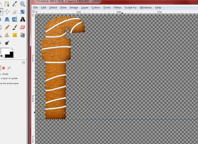
In my example, I used the "Milk and Cookies" font from DreamsFulfilled.
Makers of alphas may save each individual character in their alphabet as a separate file, or they may combine them into a single, large image typically in PNG format.
In the later case, there is much less opening and closing of files to worry about, but you will have to carefully draw a selection rectangle around each character before copying it.
In both cases, the basic technique is to individually copy each character in your title and paste it into your layout.
The Milk and Cookies alpha is one the former type: each character is its own file.
Instructions
1. Open the first character you need.
2. In the character's window, type "Cntrl-c" or select Edit->Copy
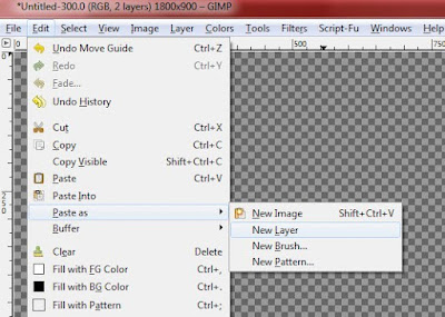
3. In your title workspace, select Edit->Paste as->New Layer
4. Use the Move tool (select by typing "m") to drag the character near the top left of your workspace. Leave a few pixels at the top in case other characters are taller.
5. To simplify placement of the rest of the characters, create a new guide lined up with the bottom of the first character. Future characters can usually "snap to" this guide.
* Tip: Create a new guide at an arbitrary location by clicking anywhere in the "ruler" bar (below the file, edit, and etc. menus) of your title workspace. Hold down the mouse button while dragging down. A new guide appears and follows your pointer. You can move this guide in the future by clicking on it when it turns red.
6. Repeat steps 1-4 for each additional character, using the guide from step 5 to line them up evenly on the bottom. Use your eye to line them up horizontally.
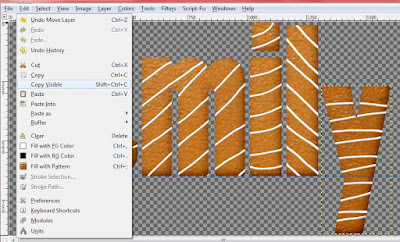
7. When all letters have been placed, go to Edit->Copy Visible, or type "Cntrl-Shift-C." This copies All layers of your title into the buffer. If you forget and simply type "Cntrl-c," you'll end up with only the active layer - i.e. one character.
8. In your scrapbook page window, select Edit->Paste as->New Layer. Use the Move tool to position the title as desired.
If necessary, use Layer->Scale Layer or the Resize tool to change the size of your title.
Don't forget to add a drop shadow!
Don't forget to add a drop shadow!
A few additional tips
* As a rule, alpha creators seem to make their letters about 1 inch - that is, 300 px - high. That may be much larger than you need. Take my advice, however, and build the title using the full resolution letters and resize only when you're ready to place the finished title.
* It is pretty common to underestimate the required size of your "workspace," and then find when you are placing the last 2-3 characters that you need more space.
Use Image ->Canvas Size to give yourself more space.
Do not worry about making your canvas exactly the same size as your title. The empty space will not cause you any serious problems on your scrapbook layout. You may also use Layer->Autocrop to clip out the extra space when you're finished.
The next methods I will cover are quite similar in that they make use of the Alpha to Selection, Selection Shrink or Grow, and the Add Bevel filter.
First let's make Raised letters from patterned paper
Let me start by stating that there are at least two relatively simple methods of doing this, and which one I use varies by what seems easiest at the time. I may explain the second in another tutorial. We're going to use the "paste into" method.
1. Open a new file of the approximate height and width of your title.
* Tip: Sometimes I use the text tool to place a simple title on my scrapbook page. After I get the font size right, I copy and paste that layer only as a new file using Cntrl-Shift-V
2. Use the Text tool to type your title in the Title Workspace (unless you used the tip above!) Choose and appropriate color for the outline of your finished title. Make it the size you want to use in your page, or *larger* - remember, it's easy to scale down; hard to scale up!
3. Here's where the magic happens.
In the Layers palate, right click on the layer containing your title. Select "Alpha to Selection" Voila! The marching ants appear around our title.
This wonderful little command has the effect of selecting everything on the layer that is not transparent - in our case, the text itself.
Amazing! Stop for a moment and contemplate all the wonderful things you can do with this power!
Or... just go on to the next step! :)
4. From the Select menu, choose Select->Shrink.
In the pop-up window, choose a value somewhere between 2 and 6 depending on the relative thickness of your font. The "marching ants" will fall back to enclose an area that much smaller than your title.
5. Now, if you haven't already, open a piece of patterned background paper. (I used one from the "Spontaneous Delight" collection from Shabby Princess. If you haven't downloaded all their free stuff, take a break for a few moments (er, hours!) and do so.
Use the rectangle select tool to select a rectangle roughly the same dimensions as your title - again, err on the size of "too big" rather than too small.
Type Cntrl-c or Edit->Copy to copy that segment of paper.
6. Back in your Title Working Space, choose Edit->Paste Into.
The paper you copied appears inside the marching ants.
7. Now - and this is important - go over to the Layers palate. You will notice there is a new layer at the top called "Floating Selection." Right-click on that layer and choose "Anchor Layer" from the pop-up menu. This will "collapse" the new funky floating layer into your exiting layer.
If you forget and choose Select->None or Cntrl-Shift-A, weird things happen - specifically, the entire block of patterned paper you copied will appear and replace your selection, obscuring your text. If that happens, don't panic: just hit Undo and follow the procedure above to defloat the layer.
8. At this point, we're looking pretty good: we have an outline around a nice title made from patterned paper. The final step is to give the whole thing some height.
Start by selecting the bottom, color-outline layer.
Start by selecting the bottom, color-outline layer.
Important: Chose Select->None or Cntrl-Shift-A to deselect your text, or the Bevel tool won't work.
From the Filters menu, choose Filters->Decor->Add Bevel.
In the pop-up, Uncheck the box labeled "Work on copy" (otherwise we'll end up with a brand new image which we don't need.)
Choose a height of anywhere between 4 and 8.
Your title should now have a nice raised look - as if it were made from slightly puffy, shiny stickers.
(If nothing appeared to happen, go back and make sure nothing is selected in your image - i.e. no "marching ants.")
Pretty cool, huh?
The last technique I will cover is Chipboard Letters.
It's very similar to the one we just did, but instead of shrinking our selection we'll be growing it, and we'll add an extra layer which we'll fill with a pattern before beveling.
Here we go
1. As in previous examples, open a new file the approximate dimensions of your finished title.
Chose your desired font and size and type your title in the window using the Text tool.
2. As before, right-click on your layer in the layer palate and choose "Alpha to Selection"
3. This time, we're going to Grow the selection. Chose Select->Grow and enter a value between 4 and 10 depending on how much "chipboard" you want to have visible around the edges.
4. Now, create a new layer. If you wish you can name it "chipboard," or leave it as default. The dimensions and other options should be left default.
5. In the Layers palate, drag your new layer Underneath your text layer.
6. On the Tools palate, select the Bucket Fill tool. Select "Pattern Fill" as the fill type and choose the "burlwood" pattern.
* Tip: I settled on the built-in Burlwood pattern as the most chipboard-like after quite a lot of experimentation. Most of the built in patterns are not very useful for scrapbooking: they're too tiny for 300dpi images. Burlwood works in this context-but not by actually Looking like burlwood! I may do another tutorial on interesting ways to use Pattern Fill at some point.
7. If you remembered to move your new layer underneath the text layer, then you should now see your text outlined with the burlwood pattern. Otherwise you'll see nothing but burlwood. Don't panic: just drag the new layer underneath and order shall be restored.
7. If you remembered to move your new layer underneath the text layer, then you should now see your text outlined with the burlwood pattern. Otherwise you'll see nothing but burlwood. Don't panic: just drag the new layer underneath and order shall be restored.
Now, choose Select->None or Cntrl-Shift-A to deselect everything.
8. Add a bevel on the bottom layer as in the last example using Filters->Decor-Add Bevel.
And, we're done. Not a bad chipboard approximation at all in my book.
A few more tips and hints before I wrap this up
* Instead of using the built-in burlwood pattern and the Bucket-Fill tool, you could instead find a nice kraft paper or chipboard-patterned paper. Then use the technique from the second example to copy a piece of that pattern and paste-into the selection. Arrange and layers and bevel the finished product as shown.
Remember to use Select->Copy Visible or Cntrl-Shift-C to copy both layers of your title to the scrapbook page.
* The other method for "cutting out" a title in patterned paper (to which I alluded before the second example) is as follows:
Open your patterned paper. Use the Text Tool to type your title in the desired size and font anywhere on the paper page. Then use the Alpha to Selection command in the layer pop-up menu to select only the text.
Here's the trick: Now select the Paper layer in the layer palate and chose Edit->Copy or Cntrl-c to copy *just the patterned paper.*
Paste it on your scrapbook page as a new layer if you don't want to outline it, or paste it as a new image (Cntrl-Shift-v) if you want to make additional changes.
You can see how this method might be more convenient at times.
* Sometimes all you need to make your text stand out is a simple outline. I routinely use the Alpha To Selection command with Select->Shrink or Select->Grow depending on the relative width of my font to get an outline. The advantage of the former is that you can do everything on the same layer. The advantage of the latter is that sometimes your fancy-shmanzy font is just too skinny!


Comments